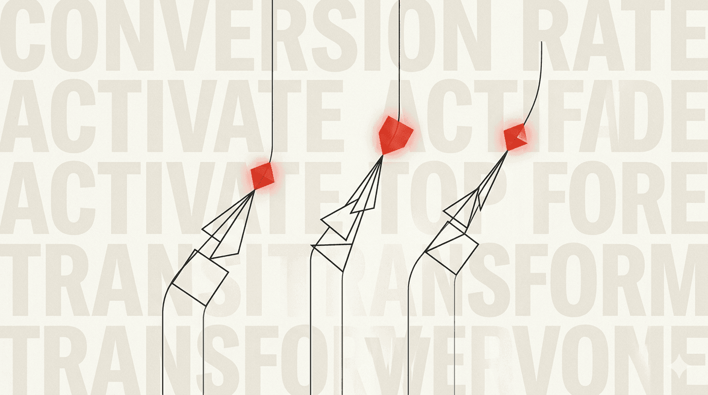
On a analysé plus de 50 sites web sur les deux dernières années. Des landing pages, des sites vitrines, des e-commerces. Et on a observé la même chose : les sites qui convertissent bien ont trois choses en commun. Toujours les mêmes trois.
Levier 1 : La clarté de la proposition de valeur
Le premier "above the fold" (ce que voit le visiteur sans scroller) doit répondre à une seule question : pourquoi rester ici plutôt qu'ailleurs ? Pas en 50 mots. En 10.
Les sites qui convertissent ont une proposition de valeur qu'on comprend en 3 secondes. Pas "solutions innovantes pour booster votre croissance". Mais "Sites livrés en 30 jours, copywriting inclus, SEO intégré".
Levier 2 : La preuve sociale bien placée
La preuve sociale fonctionne. Les études le montrent depuis des décennies. Mais là où la plupart des sites se trompent, c'est dans le placement.
Mettre les témoignages tout en bas de la page, c'est presque les cacher. La preuve sociale doit apparaître au moment précis où le doute s'installe chez le visiteur. Et ce moment, c'est généralement juste après la présentation de l'offre.
- Logos clients visibles dès le haut de page : signal de légitimité immédiat
- Témoignage spécifique avec nom, poste et entreprise : bien plus crédible qu'un prénom générique
- Chiffres concrets : "+127% de trafic en 3 mois" bat "très satisfaits du résultat"
Levier 3 : La friction réduite au minimum sur le CTA
Le Call to Action (CTA) est l'endroit où tout se joue. Et c'est souvent là que tout se perd. Voici ce qu'on observe dans les sites à fort taux de conversion :
Un seul CTA principal par page
Trop de choix tue le choix. Si vous avez "Contactez-nous", "Téléchargez notre brochure", "Inscrivez-vous à la newsletter" et "Suivez-nous sur Instagram" sur la même page, le visiteur ne sait plus où cliquer. Un CTA principal, des CTA secondaires discrets.
Un texte de bouton actif, pas passif
"En savoir plus" est passif. "Voir nos réalisations" est actif. "Réserver mon appel gratuit" est encore mieux : il dit ce que le visiteur va recevoir, pas ce qu'il va faire.
Réduire la peur de l'engagement
Ajoutez une micro-copie sous votre bouton. "Sans engagement · Réponse sous 24h · 100% gratuit". Ces trois éléments éliminent les principales objections. Le coût de cliquer perçu baisse, le taux de conversion monte.
La combinaison gagnante
Ces trois leviers fonctionnent ensemble. Une proposition de valeur claire amène le visiteur à s'intéresser. La preuve sociale transforme l'intérêt en désir. Un CTA sans friction convertit le désir en action.
Avant de repenser entièrement votre site, vérifiez ces trois points. Dans la moitié des cas, c'est suffisant pour voir une amélioration significative.